![Favicon for Dexta's Deviantart [art trade portfolio]](https://img.ngfiles.com/favicons/0/7.png?f1790847102)



![OC: K-Put [MK 1&2]](https://art.ngfiles.com/thumbnails/5511000/5511580_full.webp?f1786975022)

![Spy vs furcon pinups #2 [teg and boomba]](https://art.ngfiles.com/thumbnails/5361000/5361228_full.webp?f1780328380)
![Spy vs furcon pinups #1 [oat and vito]](https://art.ngfiles.com/thumbnails/5361000/5361226_full.webp?f1780328299)


It’s time to announce the winners!
With about 85 Submissions, this was NOT easy to decide!
But @gjk-animations , @martoline and I have made our decisions.
3rd. AEROTHETIC (LEMO8!!) [REMAKE] by @ItzBlady
https://www.newgrounds.com/art/view/itzblady/aerothetic-lemo8-remake-y2k-frutiger-aero-contest 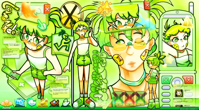
Dex:It's not just the character being in low poly but also the UI, the phone, the logos for the UI. the messages, her hecking shoes are popup icons WHAT?
also using aerothetic as an insult is something so satisfying to this world.
G.J.K.: I think this one's a tad bit too cluttered to be first, it's hard to know where I'm supposed to be looking! Maybe that's just the coloring that's letting it down, the basic inking of the sketch looks great to my eyes.
martoline: This piece has really charming visual details, a cohesive design, and the use of such bright lime green definitely gives off a clean, 2000s aesthetic! I love the variety of styles the OC has, and how EVERYTHING comes together so harmoniously. It definitely deserves a spot on the podium for all the great work and effort put into it!
2nd. Dance to it! by @NinAcTi0N
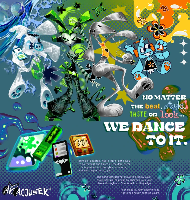
https://www.newgrounds.com/art/view/ninacti0n/y2k-collab-contest-dance-to-it?updated=1789870355
Dex: I keep coming back to this piece over and over. The idea of this as a late night advertisement in the 2000s is pictured so vividly in my mind.
There are certainly some adjustments I would make, like reaaallly pushing the other 2 bunny characters [white and silver] into different art styles, blue on the right is perfect example.
I'd also adjust the background so the 4 girls can stand out and pop alot more.
But damn, DAMN is this a great art piece, so great i can over look the minor gripes. I can believe this is real and believe these girls would end up in a ton of advertisement campaigns and perhaps a music video. Each of them blend such a different style while fitting the motif neatly!
martoline: A nice poster that seeks to move away from the conventional aesthetics seen in other works, which in my opinion contributes a lot in terms of originality, to vary the winners a bit I consider it quite competent for its charisma and excellent design of both the flyer and the character renders.
Good job!
G.J.K.: Has a nice vintage ad feel to it, though I must admit it looks a bit cluttered.
All the art on display is top-notch, but it's hard to know where I should be looking at! Maybe this is just how 2000's print ads looked, I'm a bit out of my field here.
1st. In a perfect world by @Ninsterliscious
https://www.newgrounds.com/art/view/ninsterliscious/in-a-perfect-world
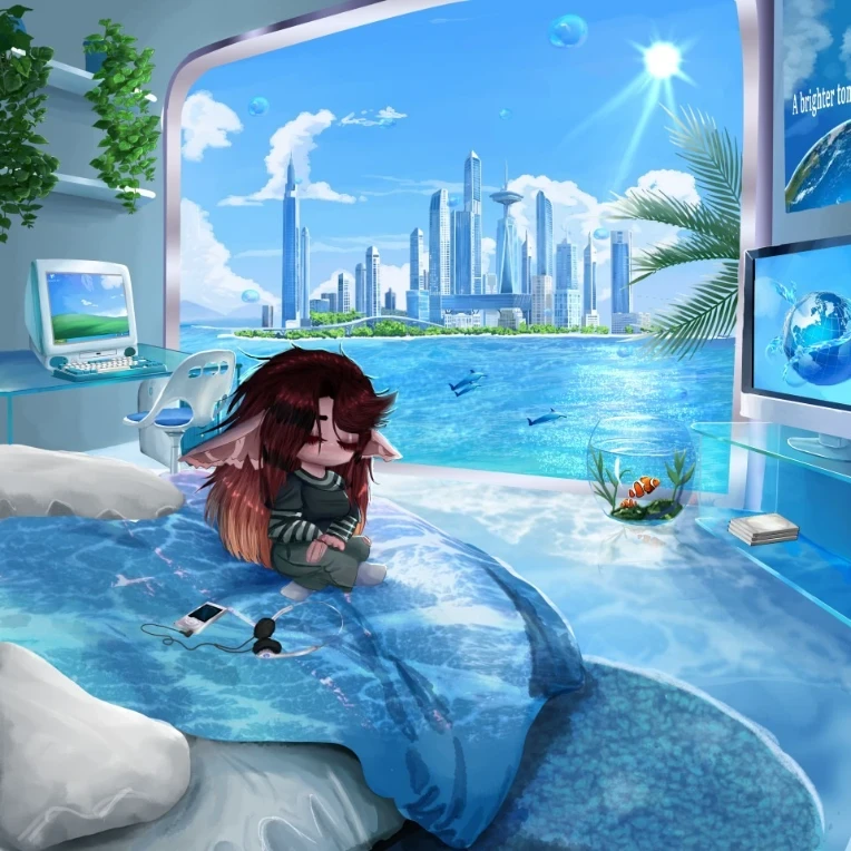
Dex: this was a slow burn...the realization that the world and everything looks perfect, yet the girl in the piece not only doesn't fit, but also appears...sad? melancholy? Perhaps she's in the wrong time era. a 2000s girl in a frutiger aero world..
martoline: A charming piece …the environment as well as the character are very well modeled and everything together becomes exquisite to look at. The use of colors, shadows, glows etc etc also make it a visually competent and very complex work…Congratulations on that awesome drawing
G.J.K.: WOW this one is detailed! It's almost like if a Renaissance painting was made in the 2000's, that's the only type of art I can think of with this amount of detail!
Congratulations to all the winners!
TO THE WINNERS: please keep your eyes peeled in your DMs for how you’ll receive the money.

☆2000s Nostalgia☆ by @Macaquinh0 https://www.newgrounds.com/art/view/macaquinh0/2000s-nostalgia
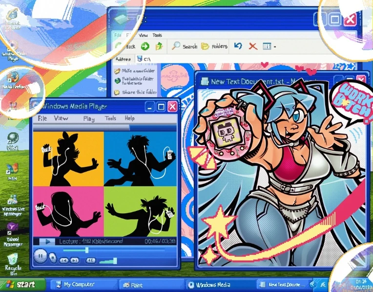
Dex: i'm a sucker for miku, but having all 4 of the characters there was a genius idea too with the Ipod ad? i feel like the background is an edited screenshot but the style is on point.
martoline: Encompasses several 2000s elements that together look pretty cool, a plus is its artistic style since it manages to adapt to the different elements of the piece, it doesn't clash at all and I appreciate its colorful details and the recreation of windows XP “by hand”
A nice 2D piece that deserves a lot of recognition.
G.J.K.: The iPod ad in the old media player, you actually taking the time to draw (or at least trace) the Windows XP desktop taskbar & all, The gal holding the tomogatchi, the bubbles, everything about it just OOZES style & charm!
Halo X WindowsXP by @CanadianTurtle
https://www.newgrounds.com/art/view/canadianturtle/y2k-collab-submission-halo-x-windowsxp-crossover
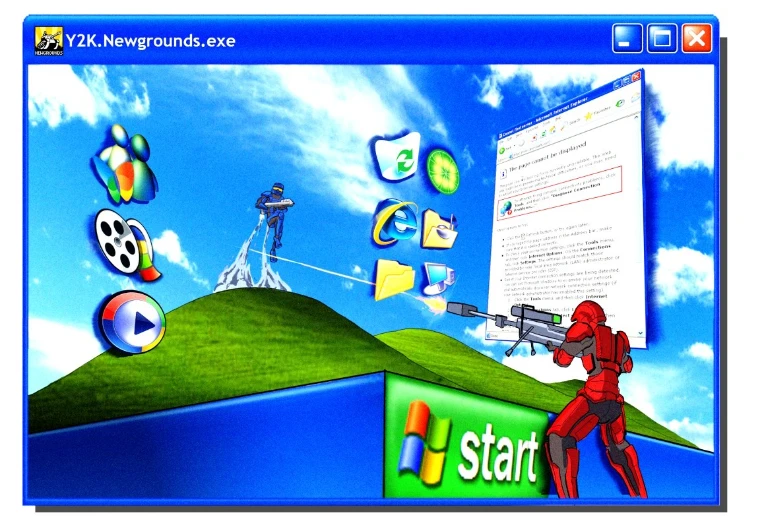
Dex: I would kill for a map like this to be playable on OG halo. with popups as cover and the hill with a flag on top. when the game is over the windows end sound plays like. It's a genius idea i've never seen before.
martoline: A piece that is FUCKING AWESOME! The use of perspective manages to convey an intense fight in that faithful recreation of the operating system, personally I would have added more points if the characters had been in 3D since the 2D clashes a bit with the whole background behind, however it deserves its spot for its originality, somewhat minimalist aesthetic and the well achieved set of elements that make it competent with the theme of the contest.
G.J.K.: I know nothing about Halo, but I do know cool art when I see it, & brother this is it! Everything being at an angle, that's a nice touch - It's well earned it's frontpage feature!
Y2K Fanzine Participation by @Lentom
https://www.newgrounds.com/art/view/lentom/y2k-fanzine-participation
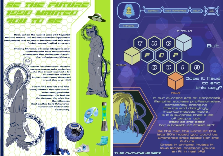
martoline: wouldn't consider it a fully competent work, but it's the strongest point of the piece.
I feel the format could have been utilized much better. The visual layout and how the texts are structured do not look that striking or competent (especially the second image); it could have been better.
Dex: Has all the ingredients but not all of it flows well together. Great text and structure but the items on page 1 felt like they don’t blend well. the art itself is great. PAGE 2 is really better structured. and i appreciate that sasquash from big lez show reference.
G.J.K.: I do love some good printed material, even if this one's digital-only! Zine making is a tough job, you're basically making a miniature magazine all by yourself! Dare I say, you did a bang-up job with it!
Other Honourable mentions:
Unreal road 2001 by @GxalaxyJames1 https://www.newgrounds.com/art/view/gxalaxyjames1/unreal-road-2001
Golden Sun by @Schreckengast
https://www.newgrounds.com/art/view/schreckengast/golden-sun
Western Release by @Koyle https://www.newgrounds.com/art/view/koyle/shame-this-didn-t-get-a-western-release
Frutiger by @Tuxed
https://www.newgrounds.com/art/view/tuxed/frutiger
Scrap Trap by @StylusBox https://www.newgrounds.com/art/view/stylusbox/scrap-trap-poster-magazine
you can find EVERYONE's submissions in one playlist here:
https://www.newgrounds.com/playlist/557578/y2k-frutifer-aero-contest-collab
We’d like to thank everyone for participating! Even if you didn’t get mentioned we DID see your art piece and had thoughts and reviews towards them. I never thought we’d get this many submissions!


![Cover Arts made for Novatone [2022-2024]](https://art.ngfiles.com/thumbnails/5369000/5369206_full.webp?f1780692437)




![[F4M] Alien nurse comforts but then a spaceship crashes](https://aicon.ngfiles.com/1513/1513745.webp?f1768360132)